
In this tutorial, We will learn how to create a line graph using Python and Matplotlib library for plotting data coming from an Arduino or Embedded system.
The Tutorial explains about the main concepts that underpin the Matplotlib like Figure & Axes and then we look into creating ticks, changing colour and thickness of the plot line ,how to change the default marker ,how to enable or disable the Grid lines in the Graph etc.
We will also learn how to create real time animations to plot the data coming from an external source like Arduino or Data Acquisition system like Lab jack using Matplotlib's FuncAnimation() function.
The Tutorial is designed for beginners who wants to learn the Matplotlib for building Data acquisition and logging applications using Arduino, Raspberry Pi etc.
Contents
- SourceCodes
- Installing Matplotlib
- Main Concepts Behind Matplotlib
- Creating a Simple Line Chart using Matplotlib
- Creating a Comprehensive Line Chart in Matplotlib
- Using the subplots() method
- Using the .plot() method to draw the graph
- Setting graph line thickness & style
- Controlling Marker shape and size
- Naming the plot & Creating a Legend
- Setting the name of X and Y Axis
- Setting Gridline Color & Visibility
- Changing the Properties of a Single Gridline
- Controlling Ticks in Matplotlib
- Creating multiple Plots on the Same Window
Matplotlib Animation Tutorial for Beginners
- Animating a Line Chart in Real Time using Matplotlib
- How FuncAnimation() works in Matplotlib
- Saving the Animated Graph as a GIF Image
- Creating a Line Scrolling Real time Line Chart in Matplotlib Library
- Using Deque Data Structure
- FuncAnimation() differences
- Disabled Blitting
- Implementing Scrolling Action in Matplotlib
Source Codes

All the Python Source codes for Matplotlib Library are available on our GitHub.
Download Matplotlib Python Source Codes as Zip files from here
Browse Matplotlib Python Source Codes
Installing Matplotlib
Matplotlib can be installed easily using Python's package manager, pip using the below command.
python -m pip install matplotlibConcepts Behind Matplotlib
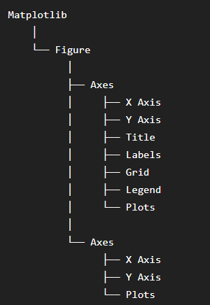
The two main concepts that you have to understand before creating a matplotlib chart or graph are
Figure
Axes
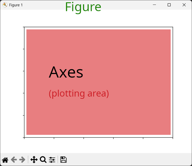
Here Figure is the whole main window or the canvas which contain your graphs/plots.
While Axes is the actual plotting area where our graphs are drawn or plotted.
Please note that Axes is different from Axis (x or y).
A single Matplotlib Figure can have multiple Axes as shown below.
No Values have been plotted to the axes.
import matplotlib.pyplot as plt

figure,axes = plt.subplots(nrows=2,ncols=2) # this will create
                                            # 4 axes shown below
plt.show()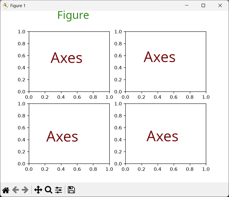
You can also have multiple Figures with multiple Axes as shown below.
import matplotlib.pyplot as plt

figure1,axes1 = plt.subplots(nrows=1,ncols=2) #create Figure1 and its axes
figure2,axes2 = plt.subplots(nrows=2,ncols=3) #create Figure2 and its axes

plt.show()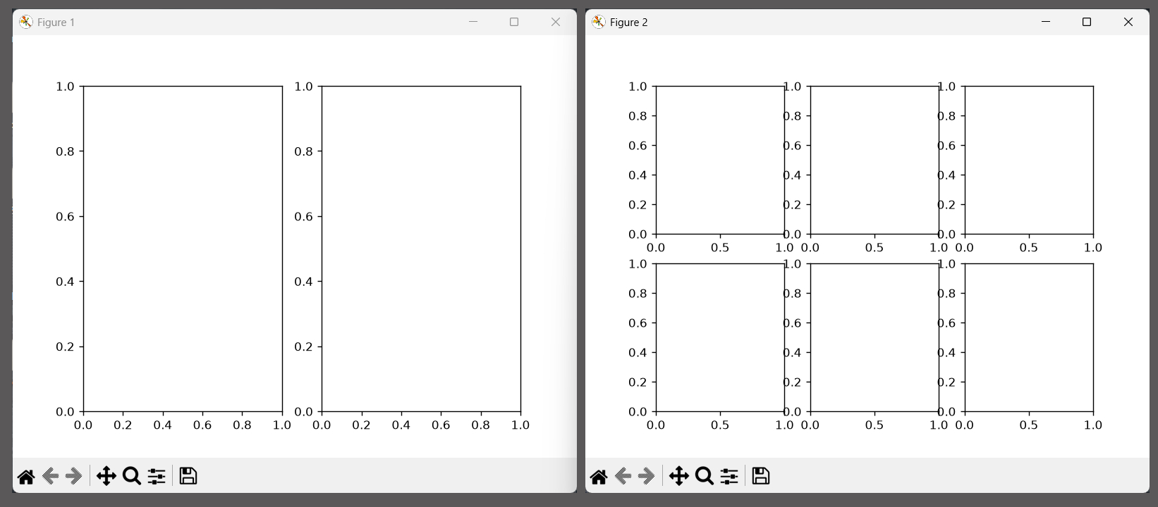
Creating a Simple Line Chart using Matplotlib
Now we will create a simple Line Chart using the Matplotlib Python Library.
The main steps needed to create a line plot or chart is shown below.
Create a list of x and y values which are needed to draw the line
Create a Figure and Axes Object using the subplots() method
Now Plot the x and y values on the plotting area (axes) using .plot() method
call .show() method to show the plots on the screen
You can find the code for doing that below.
#Simple Line chart

import matplotlib.pyplot as plt


x= [1,2,3,4, 5,6, 7,8, 9,10,11,12,13,14,15]    #list of values on x axis
y= [-5,0,5,10,0,20,0,12,7,-1,3,8,2,0,-16]      #list of values on y axis

figure,axes = plt.subplots() # creates a drawing area for your graph
                             # returns a figure and an axes object
                             # tuple expansion

axes.plot(x,y,'-o') # plot x,y values on axes object.
                    #  '-' means straight line ,'o' is the marker ,shorthand notation

#axes.plot(x,y,'r--^') # colour of line=red,dashed line,triangle marker^

axes.set_title('Name of the Axes') #set the name of the Axes
axes.grid(True) #show grid lines

figure.canvas.manager.set_window_title('Name of the Window') # Setting the name of the Window/Figure

plt.show()
On running the Code it will create the below window.
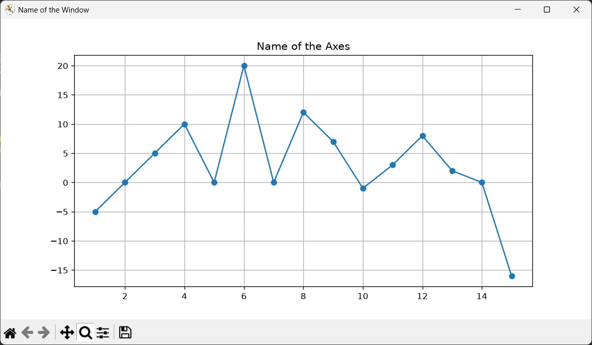
Here
figure,axes = plt.subplots() # creates a drawing area for your graphcreates the Figure and Axes which are returned as a tuple, so we are using tuple unpacking to get the Figure and Axes values.
axes.plot(x,y,'-o') # plot x,y values on axes object.We then plot a graph on the Axes using .plot() function. We provide a list of x and y values and the type of line we wish to draw.
here
'-o'  # means straight line with marker that looks like a o
'--o' # means dashed line with marker that looks like a o
'r--^' # means a red dashed line with marker that looks like a triangle
We can set the name of the Window/Figure in Matplotlib using
figure.canvas.manager.set_window_title('Name of the Window') # Setting the name of the Window/Figureand finally we call the plt.show function to display the image on the screen
plt.show()
Creating a Comprehensive Line Chart in Matplotlib
Here we will create a more feature rich line chart that will show all the major parts of the graph like Grid lines ,Major and Minor Ticks, Legend, changing color of the lines or grid lines etc.
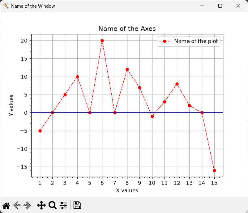
The code for creating the graph is shown below.
# Comprehensive Line chart
import matplotlib.pyplot as plt
from matplotlib.ticker import MultipleLocator

x= [1, 2,3,4, 5,6, 7,8, 9,10,11,12,13,14,15]    #list of values on x axis
y= [-5,0,5,10,0,20,0,12,7,-1,3, 8,2,0,-16]      #list of values on y axis

figure,axes = plt.subplots(nrows=1,ncols=1) # creates a drawing area for your graph
                                            # returns a figure and an axes object
                                            # tuple expansion

#Setting up how the plot should look and feel
axes.plot(x,
          y,
         linestyle  = '--', #'--' dashed line , '-' Straight line ,':' dot line  ,'-.' dash-dot line
         linewidth  = 1,
         marker     = 'o', #'o' o marker ,'s' square marker ,'^' traiangle marker
         markersize = 5,
         color      = 'red', #other colours ,blue,green,red etc also hex values color='#FF5733'
         label      = 'Name of the plot' #used by the Legend

         )

#set the name of the Axes object
axes.set_title('Name of the Axes') #set the name of the Axes
axes.set_xlabel("X values")
axes.set_ylabel("Y values")

#Controlling the ticks on x any axis
axes.xaxis.set_major_locator(MultipleLocator(1)) #spacing = 1 units
axes.yaxis.set_major_locator(MultipleLocator(5)) #spacing = 5 units

axes.minorticks_on() #Activate Minor ticks

axes.legend()

#Control how the Grid lines Behave
axes.grid(True)
axes.axhline(0, color="blue", linewidth=1)

figure.canvas.manager.set_window_title('Name of the Window') # Setting the name of the Window/Figure

plt.show()
using the subplots() method
Here first we create the figure and axes using the subplots() method.
figure,axes = plt.subplots(nrows=1,ncols=1)unlike the previous method we are using parameters nrows and ncols and giving them numbers (1,1). This helps to specify the layout of our graphs on the Window or Figure. Here we want an axes (graph) which has 1 row and 1coloumn ,so a single graph.
We can create graphs that are arranged in different layouts using the nrows and ncols parameter,
For example,
figure,axes = plt.subplots(nrows=1,ncols=2) #single row ,2 coloums
# 2 graphs will be side by side.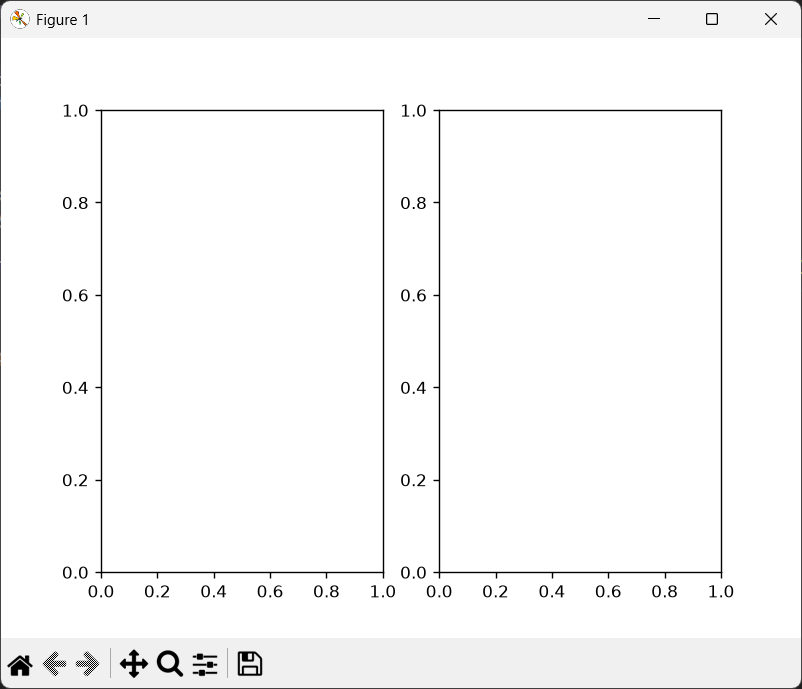
Here plots/lines and other parts are omitted for simplicity.
The two graphs are arranged side by side ,(Single Row, two columns).
You can also arrange graphs on top of one another,
figure,axes = plt.subplots(nrows=2,ncols=1) #Two Rows  ,1 coloums
# 2 graphs will be on top of one another 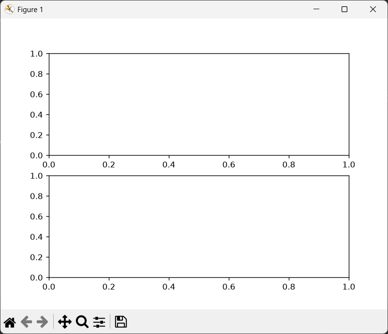
Another example
figure,axes = plt.subplots(nrows=3,ncols=2) #3 Rows ,2 coloums 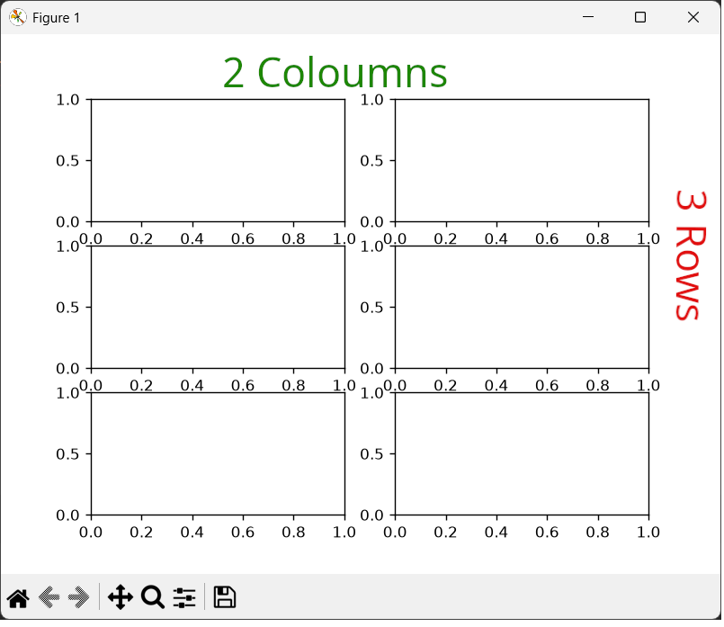
Changing Figure Size
you can use the figsize parameter in the subplots() method to control the physical width and height of the entire figure canvas in inches.
# figsize = (width,height)
# For example

figsize = (10,5) #10 inches wide ,5 inches tall
Matplotlib uses your figsize (inches) along with another property called dpi (Dots Per Inch) to calculate the actual resolution of the image in pixels. By default dpi =100
width in pixels = width provided by user in inches X dpi
height in pixels = height provided by user in inches X dpi
For example
figsize = (10,5) #10 inches wide ,5 inches tall
#by default dpi =100

width in pixels  = 10 X 100 dpi = 1000 pixels
height in pixels = 5  X 100 dpi = 500 pixels
Here is the full code
figure,axes = plt.subplots(nrows   =1,
                           ncols   =1,
                           figsize = (10,5),
                           dpi     = 100)
using the .plot() method
The .plot method is used to draw the actual graph line on the plotting area using the provided values for the x and y axis. It also provides parameters to customize the line style, width of the line ,marker size/style colour etc.
axes.plot(x,
          y,
         linestyle  = '--', #'--' dashed line , '-' Straight line ,':' dot line  ,'-.' dash-dot line
         linewidth  = 1,
         marker     = 'o', #'o' o marker ,'s' square marker ,'^' traiangle marker
         markersize = 5,
         color      = 'red', #other colours ,blue,green,red etc also hex values color='#FF5733'
         label      = 'Name of the plot' #used by the Legend

         )
axes.plot() method returns a list containing a Matplotlib line object .
return_value = axes.plot(x,y) #returns a list of line2d objects
print(return_value)
print(return_value[0])
you will get
[<matplotlib.lines.Line2D object at 0x000001B755107380>]
Line2D(_child0)
the returned Line2D object lets you modify the chart after creating it ,as it contains the information and properties of the line you just created.
For example you can change the color of the line using
return_value[0].set_color("red") #change the color of the line to red ,
                                 # using the Line2D object returned by .plot()
                                 # note the [0],first item of the list
If you use the tuple unpacking as shown below ,no need to use the array notation .
For example,
return_value, = axes.plot(x,y) # returns a list of line2d objects
                               # , note the comma ,for tuple unpacking
return_value.set_color("red")  # no need to use [0]
Controlling Plot Line Parameters
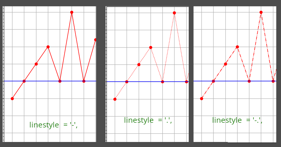
The first parameter we are going to set is the linestyle which can be a straight unbroken line ,a dashed line ,a line composed of dots and dashes etc.
You can control the size and type of style for your plot using
 linestyle  = '--', #'--' dashed line , '-' Straight line ,':' dot line  ,'-.' dash-dot line
 linewidth  = 1,
The results of various parameters are shown below.
You can also change the color of the plot line using color parameter
color = 'red', # other colours,blue,green,red#You can also use hex values like .
color='#FF5733'
Controlling Marker shape and size in Matplotlib
In Matplotlib, a marker is the symbol used to represent each individual data point on a plot. You can can see the small circles in our graph where our x and y values meet.
In our case ,marker is represented by a circle, You can change the shape and size of the marker if you wish by modifying the marker and marker size parameter in .plot method.
Commonly used markers are
'o'    Circle
's'    Square
'^'    Triangle up
'v'    Triangle down
'*'    Star
'+'    Plus
'x'    X
'.'    Point
'D'    Diamond
here is an example
marker     = 's', #'s' square marker ,
markersize = 5,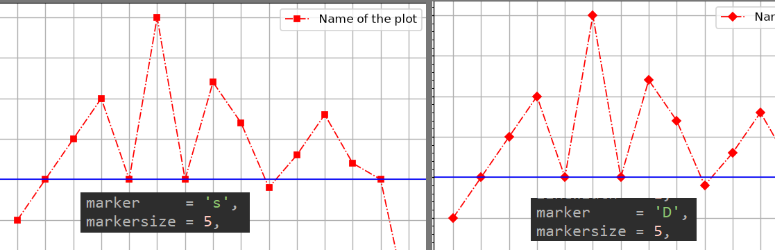
Creating a Legend for your Plot
You can give a specific label for your plot using the label parameter which is then used by .legend() method to display a legend on top of your plotting area.
#Setting up how the plot should look and feel

axes.plot(x,
         y,
         .....
         label      = 'Name of the plot'  #used by the Legend
         ....
         )
axes.legend()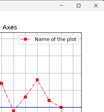
The above image shows the Legend of the plot.
Legend name is "Name of the plot" and it shows the colour of the plot line (here red) and marker shape (here square) so user can distinguish it from other plots on the same graph.
This is more useful in graphs with multiple plot lines.
Setting the name of Axes object and Axis's (x and y)
Here we are going to give a name to our plot or our axes object (different from Axis).The whole plotting area is called as an Axes object in Matplotlib which contains the X and Y Axis.
First we set the name of our Axes object ,that will be the name of our plot using
axes.set_title('Name of the Axes') #set the name of the AxesThis will show as the text " Name of the Axes" on the top of the plot as shown below
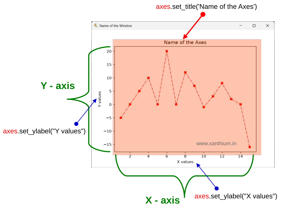
Now we are going to set the name of the x and y axis of our plot, this is done by using the methods provided by the axes object
axes.set_xlabel("X values") # set the name of the x axis
axes.set_ylabel("Y values") # set the name of the y axis
You can see the results in the above image.
Using Gridlines in Matplotlib
Gridlines are the horizontal and vertical lines shown inside a graph (plotting area ). They make it easier to read and compare data values more easily.
You can activate the Gridlines on Matplotlib using
axes.grid(True) #activate the Gridlines on MatplotlibYou can change the color of the gridlines using
axes.grid(color='green') # gridlines will be green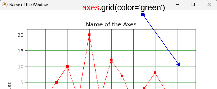
You can also use other colors or hex notation.
axes.grid(color='blue')
axes.grid(color='green')
axes.grid(color='gray')
axes.grid(color='#FF5733')
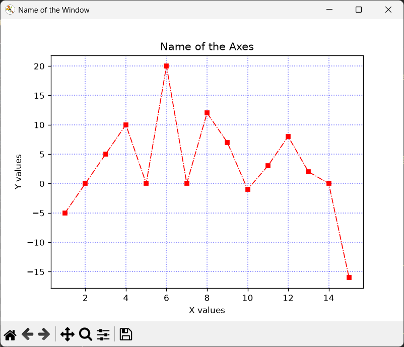
You can also change the line style ,line thickness, transparency of the grid lines etc. You can combine them in a single method as shown below.
axes.grid(
		  axis     = 'both',  # x and y axis gets grid lines
          visible   = True,   # Grid visibility
          color     = 'blue', # Grid Colour
          linestyle = ':',    # Grid line style  '--', #'--' dashed line , '-' Straight line ,':' Straight line  ,'-.' dash-dot line
          linewidth = 1,      # thickness of the Grid line
          alpha     = 0.5     # transparency of the gridline ,0 fully transparent,1 fully opaque
         )
Changing the properties of a single gridline
Some times we may need to change the colour of a single gridline to denote the zeroth line on the x or y axis.one of the easiest way to do is to uses the
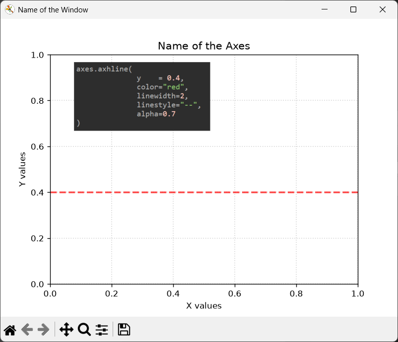
axes.axhline() method,Here axhline() means 'axes horizontal line. It draws a horizontal line across your Matplotlib axes at a specified y-value
axes.axvline() method, Here axvline() means 'axes vertical line. It draws a vertical line line across your Matplotlib axes at a specified x-value.
here is a more detailed explanation of its parameters
# changes the color,style,width of horizontal grid line
axes.axhline(
              y    = 0.4,
              color="red",
              linewidth=2,
              linestyle="--",
              alpha=0.7
)
on running this you will get a Red line (dashed line )drawn at the coordinate y = 0.4
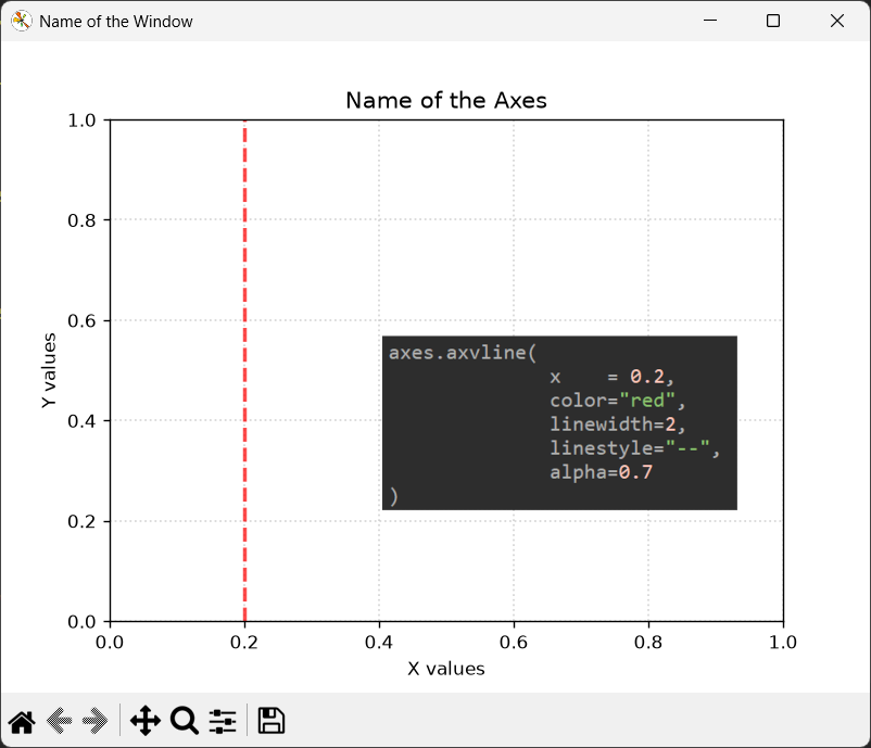
This will alter the appearance of the vertical gridline at a specific x coordinate.
# changes the color,style,width of vertical grid line
axes.axvline(
             x    = 0.2,
             color="red",
             linewidth=2,
             linestyle="--",
             alpha=0.7
)
On running this you will get a Red line (dashed line )drawn at the coordinate x = 0.2
Controlling Ticks in Matplotlib
A tick is a small mark on an axis (x or y) that tells you where a particular value is located.
In Matplotlib, ticks are reference marks placed along the axes of a plot to indicate specific positions or values on the coordinate system. They help the viewer interpret the scale of the graph and determine the numerical value associated with a particular location.
The small vertical (|) or horizontal marks (-) are ticks, while the numbers displayed beside them are tick labels. Each tick represents a particular position on the x-axis or y axis.
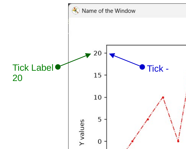
A tick is the small mark on the axis (x or y),The corresponding tick label is the text that identifies its value. Thus, a tick indicates where a value occurs, while its label tells us what that value is.
In Matplotlib, these two aspects can be controlled independently.
How Matplotlib Chooses Ticks
When you create a plot, you normally don't need to specify any ticks yourself. Matplotlib automatically determines where ticks should appear, how many there should be, and what their labels should say.
Matplotlib examines the range of the axis and chooses reasonable locations for the major ticks.
This automatic behavior is controlled mainly by locators and formatters.
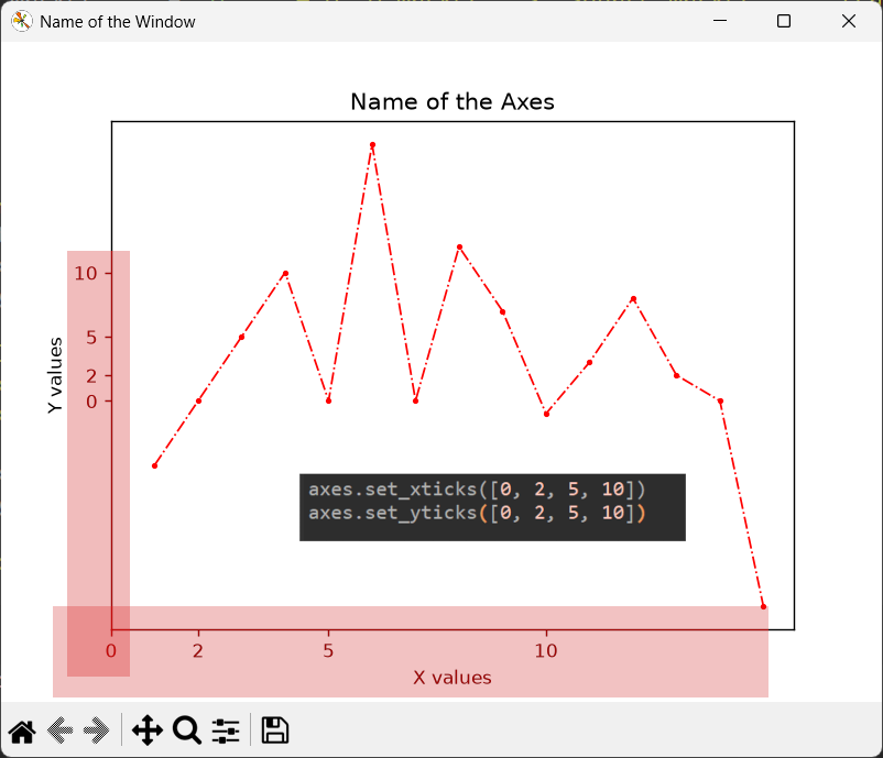
You can manually place ticks on the x and y axis using set_xticks() for the x-axis and set_yticks() for the y-axis.
For example
#manually place ticks on the x and y axis using set_xticks() for the x-axis and set_yticks()
axes.set_xticks([0, 2, 5, 10])
axes.set_yticks([0, 2, 5, 10])
This will result in
If you find Manually placing Ticks on the X and Y axis tedious you can do it automatically using MultipleLocator() Method.
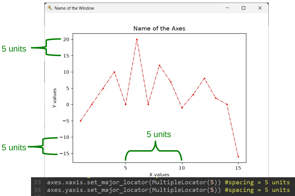
You can feed the method, the interval you want between ticks (Major Ticks)
from matplotlib.ticker import MultipleLocator #import the MultipleLocator

axes.xaxis.set_major_locator(MultipleLocator(5)) # place major ticks at multiples of 5 on X Axis

axes.yaxis.set_major_locator(MultipleLocator(5))# place major ticks at multiples of 5 on Y Axis
Here there will be an interval of 5 between Ticks as shown below.
Major and Minor Ticks
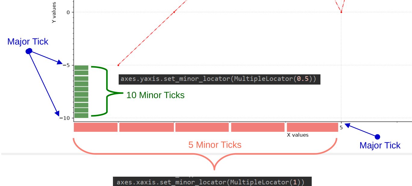
The ticks we have discussed so far are called major ticks. You can further divide the intervals between major ticks into smaller subdivisions using minor ticks.
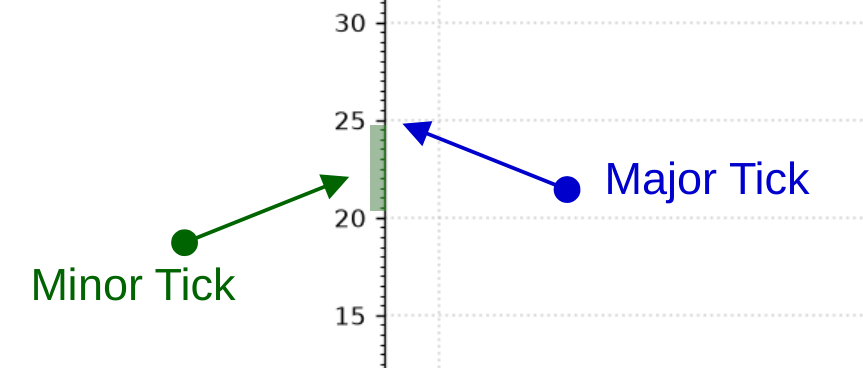
Here we will learn to set the Minor Ticks on our plot.
First thing to do is to enable the Minor Ticks using
axes.minorticks_on() #Activate Minor ticks
You can change the Minor Tick interval using.
axes.xaxis.set_minor_locator(MultipleLocator(1))
axes.yaxis.set_minor_locator(MultipleLocator(0.5))
this will result in
Creating multiple Plots on the Same Window
In all the previous examples ,we were plotting a single graph on our Figure Window. Matplotlib allows you to plot multiple graphs inside a single window.
Here we will create two or more plots in the same window /Figure using matplotlib as shown in the below figure.
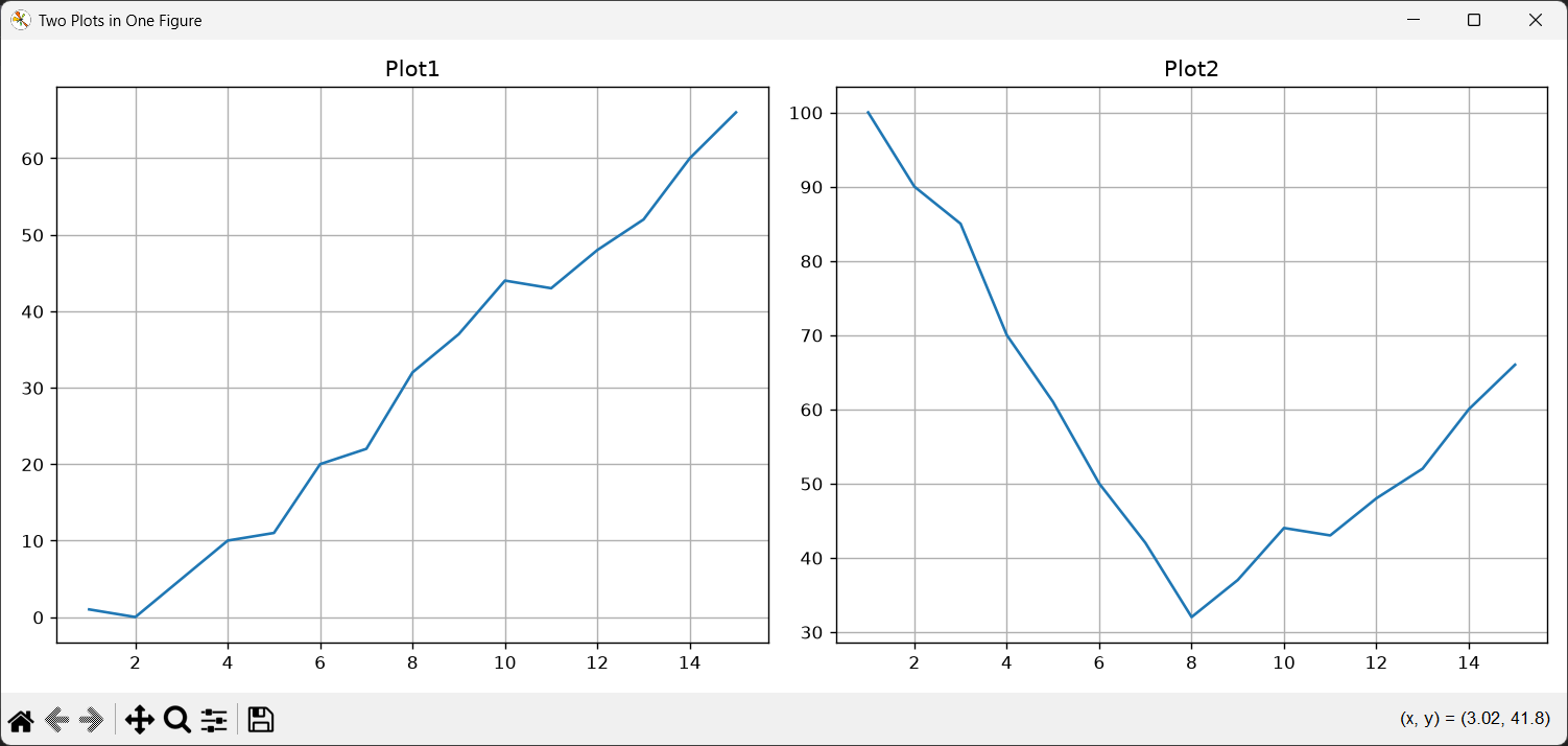
The code for creating the two graphs in the same window using Matplotlib is shown below.
#creating two plots on the same window
import matplotlib.pyplot as plt

#data for the first plot
x1= [1, 2,3,4, 5,6, 7,8, 9,10,11,12,13,14,15]    #list of values on x axis
y1= [1,0,5,10,11,20,22,32,37,44,43,48,52,60,66]  #list of values on y axis

#data for second plot
x2= [1, 2,3,4, 5,6, 7,8, 9,10,11,12,13,14,15]        #list of values on x axis
y2= [100,90,85,70,61,50,42,32,37,44,43,48,52,60,66]  #list of values on y axis

figure,axes = plt.subplots(nrows=1,ncols=2,figsize=(12,5)) # create two axes,side by side
                                                           # single row ,double columns
                                                           # figsize specifies the size of the Matplotlib figure.
                                                           # figsize=(width,height) in inches
axes[0].plot(x1,y1) # plot the first graph
axes[1].plot(x2,y2) # plot the second graph

axes[0].set_title('Plot1')
axes[1].set_title('Plot2')

axes[0].grid(True) # enable grid for first  graph
axes[1].grid(True) # enable grid for second graph

plt.tight_layout() #automatically adjusts the spacing between subplots so that titles, axis labels, and tick labels don't overlap

figure.canvas.manager.set_window_title('Two Plots in One Figure') # Setting the name of the Window/Figure

plt.show()
First we create a sample set of data for plotting the two graphs.
#data for the first plot
x1= [1, 2,3,4, 5,6, 7,8, 9,10,11,12,13,14,15]    #list of values on x axis
y1= [1,0,5,10,11,20,22,32,37,44,43,48,52,60,66]  #list of values on y axis

#data for second plot
x2= [1, 2,3,4, 5,6, 7,8, 9,10,11,12,13,14,15]        #list of values on x axis
y2= [100,90,85,70,61,50,42,32,37,44,43,48,52,60,66]  #list of values on y axis
The basic idea of creating two plots(graphs) inside a single window is to create two axes object using the subplots() method.
# create two axes,side by side
figure,axes = plt.subplots(nrows=1,ncols=2,figsize=(12,5))
The figsize=(12,5) is used to set the size of the figure or the Window in Inches. Its basic parameters are figsize=(width,height) in inches
Here we are using the nrows and ncols parameter in the subplots() method to define the number and position of the graphs (axes object).
Here we will have a single row (nrows=1) and two column of graphs (ncols=2).This will create two axes objects which we will use for plotting our data.
That means that the graph will be placed side by side.
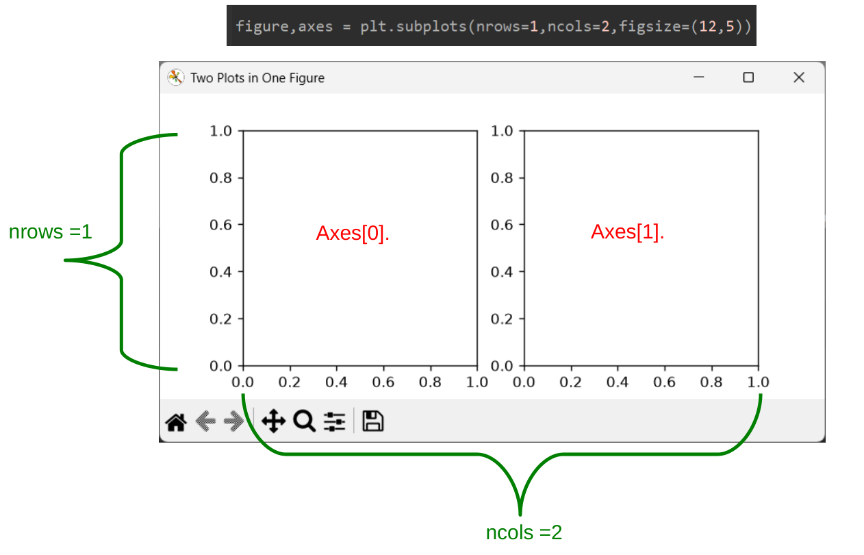
Now you can access each axes object using array notation and call its corresponding plot() function.
axes[0].plot(x1,y1) # plot the first graph
axes[1].plot(x2,y2) # plot the second graph

axes[0].set_title('Plot1')
axes[1].set_title('Plot2')

axes[0].grid(True) # enable grid for first  graph
axes[1].grid(True) # enable grid for second graph
here
plt.tight_layout()plt.tight_layout() is a Matplotlib command that automatically adjusts the spacing between subplots so that titles, axis labels, and tick labels don't overlap or get cut off.
Creating 4 plots in a Single Window
Here we will learn to create 4 plots on a single Matplotlib window using Python.
The code is shown below.
#creating 4 plots on the same window

import matplotlib.pyplot as plt

#data for the first plot
x1= [1,2,3,4, 5,6, 7,8, 9,10,11,12,13,14,15]     #list of values on x axis
y1= [1,0,5,10,11,20,22,32,37,44,43,48,52,60,66]  #list of values on y axis

#data for second plot
x2= [1, 2,3,4, 5,6, 7,8, 9,10,11,12,13,14,15]        #list of values on x axis
y2= [100,90,85,70,61,50,42,32,37,44,43,48,52,60,66]  #list of values on y axis

#data for third plot
x3 = [1, 2, 3, 4, 5, 6, 7, 8, 9, 10, 11, 12, 13, 14, 15]  # list of values on x axis
y3 = [1, 2, 3, 4, 5, 6, 7, 8, 9, 10, 11, 12, 13, 14, 15]  # list of values on y axis

#data for Fourth plot
x4 = [1, 2, 3, 4, 5, 6, 7, 8, 9, 10, 11, 12, 13, 14, 15]
y4 = [2, 4, 6, 8, 10, 12, 14, 16, 18, 20, 22, 24, 26, 28, 30]

figure,axes = plt.subplots(nrows=2,ncols=2,figsize=(12,5)) # create 4 axes,side by side
                                                          # double row ,double columns
                                                          # figsize specifies the size of the Matplotlib figure.
                                                          # figsize=(width,height) in inches
axes[0,0].plot(x1,y1,'red')   # plot the first graph
axes[0,1].plot(x2,y2,'green') # plot the second graph
axes[1,0].plot(x3,y3,'blue')  # plot the third graph
axes[1,1].plot(x4,y4,'grey')  # plot the fourth graph

axes[0,0].set_title('Plot1')
axes[0,1].set_title('Plot2')
axes[1,0].set_title('Plot3')
axes[1,1].set_title('Plot4')

plt.tight_layout() #automatically adjusts the spacing between subplots so that titles, axis labels, and tick labels don't overlap

figure.canvas.manager.set_window_title('Four Plots in One Figure') # Setting the name of the Window/Figure

plt.show()
We will use the nrows and ncols parameter in the subplots() method to create the 4 plots.Here we will create 4 Axes objects and use them to plot the graphs.
figure,axes = plt.subplots(nrows=2,ncols=2,figsize=(12,5)) # create 4 axes,side by side
                                                           # double row ,double columns
This will create
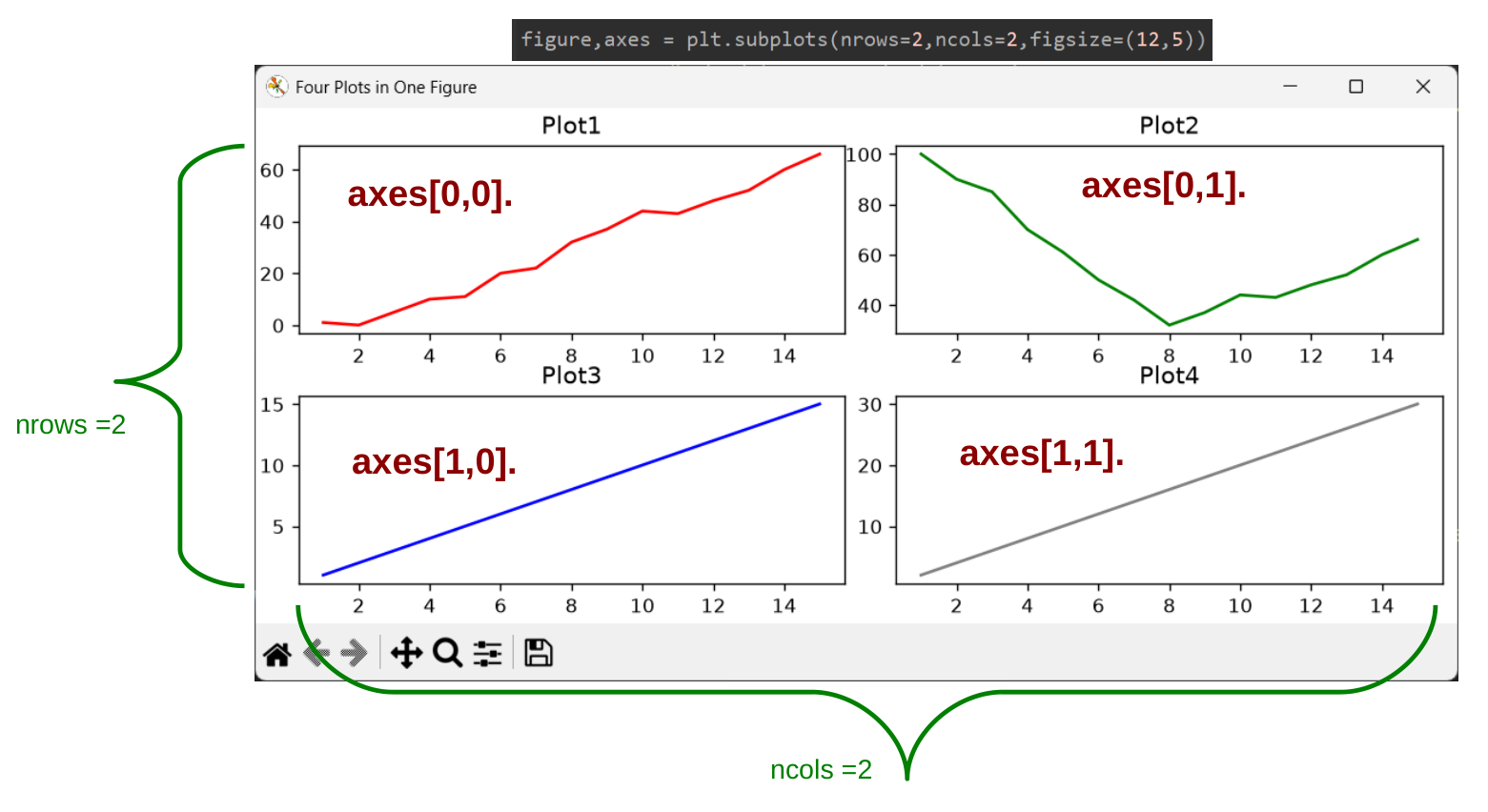
Now you can use the matrix notation to access each individual plots.
axes[0,0].plot(x1,y1,'red')   # plot the first graph
axes[0,1].plot(x2,y2,'green') # plot the second graph
axes[1,0].plot(x3,y3,'blue')  # plot the third graph
axes[1,1].plot(x4,y4,'grey')  # plot the fourth graph
Animating a Line Chart using Matplotlib
In this section, we will explore how to animate a line chart using Matplotlib and Python .Here we will be covering the basic setup for animating a line chart, animation function used , and key techniques needed to bring a static plot to life using Matplotlib's FuncAnimation() function.
FuncAnimation() is a function available in matplotlib.animation package that helps you create animations by repeatedly updating a chart.
First thing to do is to import the required libraries for animation from the Matplotlib library.
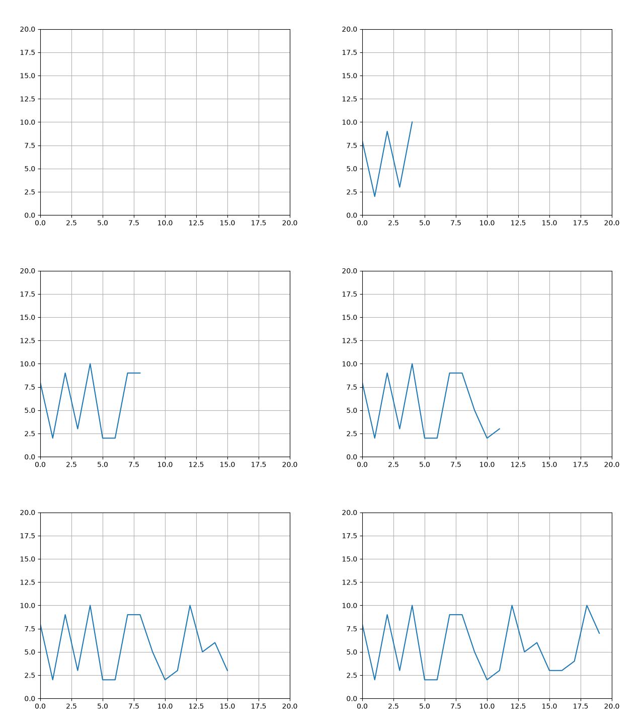
from matplotlib.animation import FuncAnimation Now you can create a simple line chart animation using FuncAnimation() function. The values in the line chart are advancing every second and it will stop after 20 seconds. The y values are generated randomly.
#Simple Line chart Animation using FuncAnimation() Function

import random
import matplotlib.pyplot as plt
from matplotlib.animation import FuncAnimation #needed for animation function

x = []     # create empty lists to hold x cordinates
y = []     # create empty lists to hold y cordinates

figure, axes  = plt.subplots() #create the figure and axes object,use tuple expansion

(line, ) = axes.plot([], []) # create a Line2D object by giving empty lists to .plot()
                             # line, comma means tuple expansion

axes.set_ylim(0, 20)   # set limits on y axis 0-20
axes.set_xlim(0, 20)   # set limits on x axis 0-20

axes.grid(True)

#update function called by FuncAnimation(fig,update,...)
def update(frame):

   print(f'frame = {frame}')

   x.append(frame)                # create the x cordinate for the line using frame (0,1,2,.....)
   y.append(random.randint(1,10)) # create the y cordinate for the line using random number between 1 and 10
   line.set_data(x, y)  # draw line between x and y cordinate

   return (line,) # line returned as tuple

ani = FuncAnimation(
                   figure,
                   update,           # name of the update function to draw the line
                   frames  = 20,     # how many times do we need to call the update function(0-19)
                   interval= 1000,   # time interval between calling update() in ms
                   blit    = True,   # Redraw only the parts that have changed
                   repeat  = False)  # Do not repeat,end the animation once the frames reach their last value

plt.show() #displays the figure and starts the GUI's event loop.
On Running this code, It will generate an animated chart as shown below.
How FuncAnimation() works in Matplotlib
Now we will learn, how the FuncAnimation() function in the Matplotlib Library helps to animate charts in near real time to create beautiful scrolling plots of data.
First we create ,empty lists to hold x and y coordinates as shown below.
x = []     # create empty lists to hold x cordinates
y = []     # create empty lists to hold y cordinates
we create a figure and axes object just like any other charts .
figure, axes = plt.subplots() #create the figure and axes object,use tuple expansionNow unlike other charts where we plot the data directly, for animation we create a Line2D object .
We provide two empty lists to the axes.plot() function and it returns a Line2D object which we will later use to draw a line dynamically using x any coordinates passed onto it.
We use tuple expansion to get the first value inside our variable line.
(line, ) = axes.plot([], []) # create a Line2D object by giving empty lists to .plot()
                             # line, comma means tuple expansion

# this wil also work
line,  = axes.plot([], []) # create a Line2D object by giving empty lists to .plot()
Do set the limit for x any values
axes.set_ylim(0, 20)   # set limits on y axis 0-20
axes.set_xlim(0, 20)   # set limits on x axis 0-20
Now we get to the main function that animates the matplotlib plot.
def update(frame):


    x.append(frame)                # create the x cordinate for the line using frame (0,1,2,.....)
    y.append(random.randint(1,10)) # create the y cordinate for the line using random number between 1 and 10

    line.set_data(x, y)  # draw line between x and y cordinate

    return (line,) # line returned as tuple


ani = FuncAnimation(
                   figure,
                   update,           # name of the update function to draw the line
                   frames  = 20,     # how many times do we need to call the update function(0-19)
                   interval= 1000,   # time interval between calling update() in ms
                   blit    = True,   # Redraw only the parts that have changed
                   repeat  = False)  # Do not repeat,end the animation once the frames reach their last value


plt.show() #displays the figure and starts the GUI's event loop.
Once the code is run the Code runs the FuncAnimation() function and then it runs the plt.show() method.
The plt.show() method displays the figure ie is the window and starts the GUI's event loop.
FuncAnimation() is the function that continuously calls the update() method after a specific time interval has elapsed (in our case it is 1000ms or 1 second) and it passes the frame variable to the update() method.
Here are the FuncAnimation() Parameters
ani = FuncAnimation(
                   figure,
                   update,           # name of the update function to draw the line
                   frames  = 20,     # how many times do we need to call the update function(0-19)
                   interval= 1000,   # time interval between calling update() in ms
                   blit    = True,   # Redraw only the parts that have changed
                   repeat  = False)  # Do not repeat,end the animation once the frames reach their last value
Here
update is the name of the function which the FuncAnimation() calls after a specified time has elapsed which is controlled by the interval parameter.
frames is the number of times FuncAnimation() will call the update function.Here frames = 20, So it will call the update function 20 times (0-19) an then it will stop
if frames = None ,FuncAnimation() will call the update function continuously forever until the figure window is terminated by the user.
interval parameter sets the time interval between calling update() in ms (milli seconds),here interval=1000 mS,so FuncAnimation() will call the update function after every 1 second.
blit parameter says to use the blitting function or not ,here blit =True ,matplotlib will only redraw parts of the plot which has changed leaving the other parts ststic.This helps to improve performance.
Make sure that your update function should return the line object so FuncAnimation() knows which parts have changed.
If blit = False, Matplotlib completely clears and wipes the entire figure canvas and draws everything from scratch on every single frame. This includes background grids, axis ticks, frame borders, and titles.
Wiping the whole screen 20 times a second may cause your animation to stutter and look laggy if you have large number of elements.
If your background needs to move or adapt on every frame like in a scrolling line plot, you must use blit = False. otherwise the elements on the screen may not move.You can also stop returning line object because you are redrawing the whole screen from scratch.
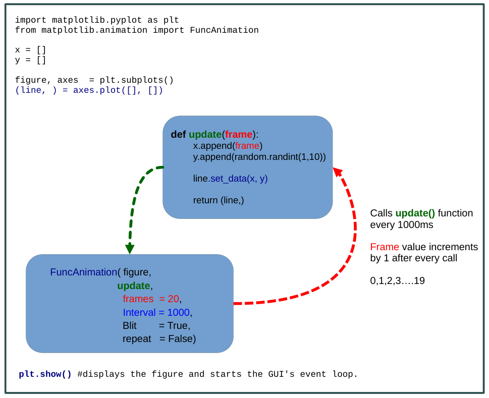
Once a frame value is passed on to the update() method .
x.append(frame)                # create the x cordinate for the line using frame (0,1,2,.....)
y.append(random.randint(1,10)) # create the y cordinate for the line using random number between 1 and 10
We appended the passed value to the list x using append() method.
And we append a random value between 1 and 10 to the list y.
so on every call the values of x and y changes as shown below.
| First call | Second call | Third call | Last call |
| x=0 | x=1 | x=2 | x=19 |
| y=3 | y=7 | y=9 | y=8 |
and
line.set_data(x, y) # draw line between x and y cordinate draws a line between corresponding points.
It continues to call the update() method every second until the frame variable reaches 19 (0 to19 =20 frames) .After which the graph stops plotting because we have set the repeat = False.
Saving the Animated Graph as a GIF Image
You can save your animated graph as a GIF image using the save() method of your animation object.
ani = FuncAnimation(..........)

ani.save("name_of_your_gif.gif", writer="pillow") # To save the graph to disk as gif
You need to have the pillow library installed on your system
Creating a Real Time Side Scrolling Line Chart in Matplotlib Library
Here we will create a Real Time Live Scrolling Chart using the Matplotlib Library and Python. The Matplotlib line chart will scroll from Right to Left displaying values on it or it advances in time to the right.As new frames are generated, the X-axis window shifts to the right, causing new data points to enter from the right edge while older data scrolls off the screen to the left.
You can find the GIF of Matplotlib side scrolling real time graph example below
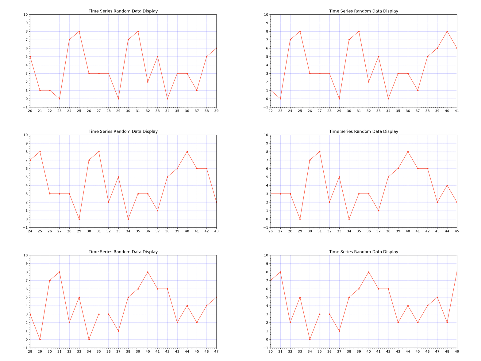
Here is the Python code for creating the above a Real Time Side Scrolling Chart using the Matplotlib Library and Python
#Python code for creating the above a Real Time Side Scrolling Chart using the Matplotlib Library and Python
#(c) www.xanthium.in 2026

import random
import matplotlib.pyplot as plt

from matplotlib.animation import FuncAnimation # needed for animation function
from matplotlib.ticker import MultipleLocator  # import the MultipleLocator

from collections import deque                  # import double ended queue

WINDOW_SIZE = 20 # no of points visible at a time

x = deque(maxlen = WINDOW_SIZE)     # create double ended lists of specific size to hold x cordinates
y = deque(maxlen = WINDOW_SIZE)     # create double ended lists of specific size to hold y cordinates

figure, axes  = plt.subplots(figsize=(10, 5)) # create the figure and axes object,use tuple expansion
                                             # set width =10 and height =5 using figsize

# create a Line2D object by giving empty lists to .plot()
# line, comma means tuple expansion
(line, ) = axes.plot([],               #empty lists for x data
                     [],               #empty lists for y data
                     linestyle  = '-', #'-' Straight line ,
                     linewidth  =  1,
                     marker     = 'o', #'o' o marker
                     markersize = 3,
                     color      = '#f9442b',          #other colours ,blue,green,red etc also hex values color='#FF5733'
                     label      = 'Name of the plot') #used by the Legend


axes.xaxis.set_major_locator(MultipleLocator(1)) # place major ticks at multiples of 1 on X Axis
axes.yaxis.set_major_locator(MultipleLocator(1)) # place major ticks at multiples of 1 on Y Axis
axes.minorticks_on()                             # Activate Minor ticks

axes.set_ylim(-1, 10)   # set limits on y axis -1 to 20
axes.set_xlim( 0, 20)   # set limits on x axis  0 to 20

axes.set_title('Time Series Random Data Display') #set the name of the Axes

axes.grid(True,color='blue',alpha =0.20) #Show grid,color = blue,alpha transparency = 0.10

#update function called by FuncAnimation(fig,update,...)
def update(frame):

  print(f'frame = {frame}')

  x.append(frame)                # create the x cordinate for the line using frame (0,1,2,.....)
  y.append(random.randint(0 ,8)) # create the y cordinate for the line using random number between 1 and 10

  line.set_data(x, y)            # draw line between x and y cordinate

  # Side-scrolling behavior
  if frame >= WINDOW_SIZE:
      print(f'axes.set_xlim({frame - WINDOW_SIZE}, {frame})')
      axes.set_xlim(frame - WINDOW_SIZE+1, frame)

  else:
       axes.set_xlim(0, WINDOW_SIZE)


  return (line,) # line returned as tuple,#can omit this since blit = false in FuncAnimation()


ani = FuncAnimation(
                  figure,
                  update,           # name of the update function to draw the line
                  frames  = None ,  # (infinite iterator),Advance frame till user closes window,0,1,2.....
                  interval= 100,    # time interval between calling update() in ms
                  blit    = False,  # Redraw everything
                  repeat  = False,  # do not repeat the plot
                  cache_frame_data = False) #do not cache anything in memory


plt.show() #displays the figure and starts the GUI's event loop.
Using Deque Data Structure
Instead of using traditional lists we are going to use Deque data structure provided by the collections framework.
Deque stands for Double-Ended Queue. It is a data structure that allows you to efficiently add and remove items from both ends of the queue.
from collections import deque                  # import double ended queue

WINDOW_SIZE = 20 # no of points visible at a time

x = deque(maxlen = WINDOW_SIZE)     # create double ended lists of specific size to hold x cordinates
y = deque(maxlen = WINDOW_SIZE)     # create double ended lists of specific size to hold y cordinates
You can add and remove data from both ends of the queue.
- If you use y.append(2) ,this will add a 2 to the right end of the queue.
- If you use y.appendleft(2) ,this will add a 2 to the right end of the queue.
here we are using the maxlen parameter to define the maximum size of our deque, making it a buffer of fixed size.
WINDOW_SIZE = 20 # no of points visible at a time

x = deque(maxlen = WINDOW_SIZE)  #deque can contain 20 elements
In our case the x will grow in size till it reaches the size of 20 elements.
Once the 21st element is appended . The first element is deleted from the Left end of the x deque.
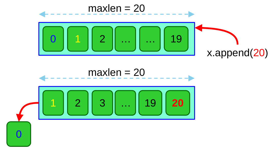
This prevents your memory from growing infinitely during continuous data streams (like sensor data, stock tickers, or live animation loops)
FuncAnimation() differences
The FuncAnimation() function used here is slightly different from the previous one.
The previous chart animation we created had a limited number of frames and run for a specified number of time, In this scrolling real time matplotlib chart we we will be continuously reading data for a long time and is not possible to specify the frame count before hand.
We also have to disable the blitting option ,because we need the whole chart to update as values are being shown on the screen.
Here is the FuncAnimation() function code .
ani = FuncAnimation(
                   figure,
                   update,           # name of the update function to draw the line
                   frames  = None ,  # (infinite iterator),Advance frame till user closes window,0,1,2.....
                   interval= 100,    # time interval between calling update() in ms
                   blit    = False,  # Redraw everything
                   repeat  = False,  # do not repeat the plot
                   cache_frame_data = False) #do not cache anything in memory
As you can see here
frames = None , # (infinite iterator),Advance frame till user closes window,0,1,2.....that means that the the frame count will advance from 0,1,2,3 till you close the window of your matplotlib plot.
Disabled Blitting
blit = False, # Redraw everything we have disabled blitting here which causes the plot to redraw everything ,this may have some performance penalty as the code have to redraw everything each frame.
Earlier when blit = True,we were only redrawing the changed parts of the plot and we need the line value returned by the update function to tell us which parts of the plot have changed.
Since we have disabled blitting here,there is no need to return the line value as we are drawing the whole plot from scratch every frame.
cache_frame_data = FalseWhen you set cache_frame_data = False in a Matplotlib animation, you are telling Matplotlib not to store the output of your animation frames in memory.
This helps in realtime plotting as the plots run for a long time and slowly eat up the available memory capacity.
If you run a long animation without explicitly setting this parameter, Matplotlib will often throw a user warning
"The animation class was configured with cache_frame_data=False but received a different value..."
or warn you that it is caching frames and consuming memory.
Implementing Scrolling Action in Matplotlib
The scrolling movement of the graph is implemented by constantly redrawing the x axis limits after a specified number of frames have passed as determined by WINDOW_SIZE constant.
#update function called by FuncAnimation(fig,update,...)
def update(frame):
  x.append(frame)                # create the x cordinate for the line using frame (0,1,2,.....)
  y.append(random.randint(0 ,8)) # create the y cordinate for the line using random number between 1 and 10

  line.set_data(x, y)            # draw line between x and y cordinate

  # Side-scrolling behavior
  if frame >= WINDOW_SIZE:
      print(f'for frame = {frame} -> axes.set_xlim({frame - WINDOW_SIZE+1}, {frame})')
      axes.set_xlim(frame - WINDOW_SIZE+1, frame)

  else:
       print(f'for frame = {frame} -> axes.set_xlim(0, {WINDOW_SIZE})')
       axes.set_xlim(0, WINDOW_SIZE)
The redrawing of the limits of the x axis are done by this section of the code.
 # Side-scrolling behavior
  if frame >= WINDOW_SIZE:

      axes.set_xlim(frame - WINDOW_SIZE+1, frame)

  else:

       axes.set_xlim(0, WINDOW_SIZE)
if the frame count is less than WINDOW_SIZE which in our case is 20 ,We do not change the limits.so the limits stay between 0 and 20.
The matplotlib places the points on the x and y axis without altering the limits.
for frame = 1 -> axes.set_xlim(0, 20)
for frame = 2 -> axes.set_xlim(0, 20)
for frame = 3 -> axes.set_xlim(0, 20)
.......
for frame = 18 -> axes.set_xlim(0, 20)
for frame = 19 -> axes.set_xlim(0, 20)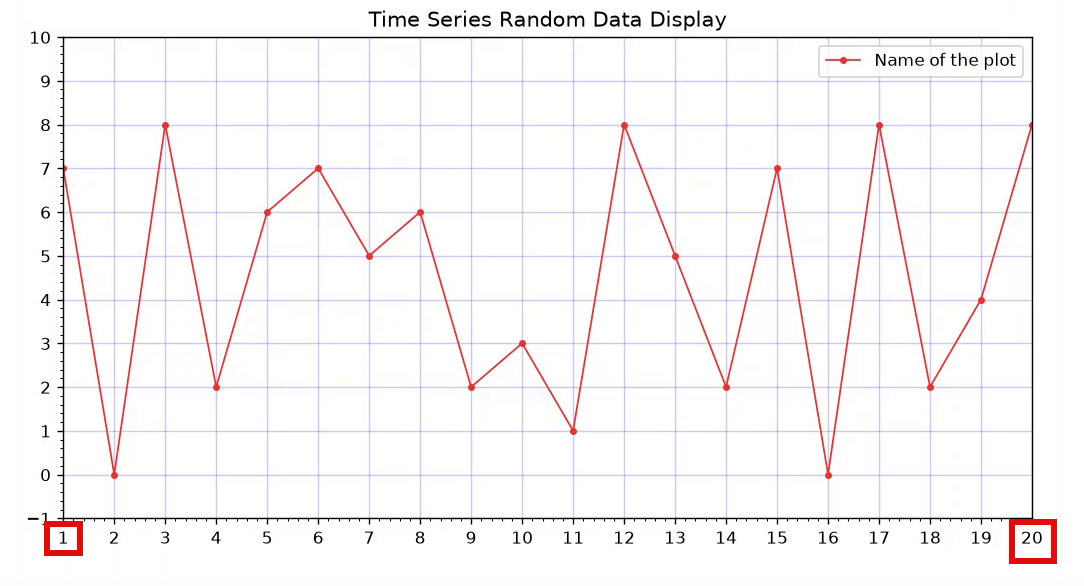
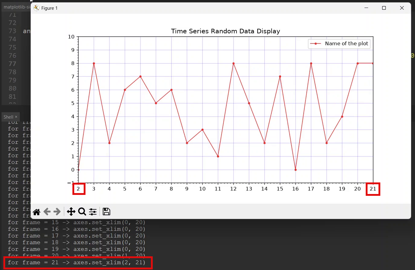
After the frame count has increased or equal to 20 (WINDOW_SIZE)
We start to change the limits of x axis and matplotlib redraws the entire graph each time update() function is called by the FuncAnimation().This gives the impression of a rolling display.
Tags
- Log in to post comments